TL;DR
A type="responsive" AdSense ad on my site rendered as a square block on mobile and grew taller than expected on desktop. The root cause was the combination of data-ad-format="auto" and data-full-width-responsive="true" — both hand control of the ad's final size to Google. I ended up not fixing this with JavaScript resize detection, but by following Google's own documented CSS media query approach and baking it into a single reusable Vue component with built-in size presets per breakpoint.
Background
This particular placement isn't on this blog — it's on bulkpictools.com, another site of mine that's a batch image-processing toolchain. I'm running this ad in two spots there: in the file upload area on the tool pages, and on the output/results page. I wired it up about a week before writing this.
I originally wired up the ad with:
<AdAdsense type="responsive" adsense-slot-id="xxxxxxxxxxxxxxxx" />
I assumed type="responsive" meant the ad would adapt its width and height to whatever container it sat in, matching the layout I'd already designed around it. That assumption turned out to be wrong — "responsive" in AdSense doesn't mean "fits your design's intended proportions," it means "Google decides the final size based on available space and ad inventory," which is a different thing.
The Problem
On mobile, the ad rendered as a square block instead of the horizontal banner shape I expected:

What surprised me more was that the desktop version wasn't stable either — the ad's height grew well past the 90px I'd designed the layout for, pushing surrounding content down:

Investigation
I started by checking whether this was a container-width problem — my first guess was that the parent element wasn't wide enough for Google to calculate a sensible size, which is one of AdSense's own documented failure modes for responsive units. That wasn't it; the container had a defined width.
Inspecting the actual <ins> element in the rendered DOM pointed at the real cause: the component was setting
ins.style.width = '100%'
ins.dataset.adFormat = 'auto'
ins.dataset.fullWidthResponsive = 'true'
data-ad-format="auto" combined with data-full-width-responsive="true" tells Google to calculate both dimensions itself, expanding to the full width of the screen on mobile and choosing whatever height fits the available ad inventory. On mobile that frequently meant falling back to a 300×250 or 250×250 rectangle slot rather than a horizontal banner. On desktop, with no explicit height constraint on either the <ins> tag or its parent, the calculated height wasn't pinned to 90px the way a 728×90 banner unit would be.
I considered three different ways to fix this, in this order:
- JavaScript resize detection — track
window.innerWidth, swap between abanner(728×90) andrectangle(300×250) ad type/slot pair on the client, with aresizelistener to re-trigger the swap when the breakpoint is crossed. - Force a fixed-size
bannerunit everywhere — dropresponsiveentirely and hardcode728×90. - Google's own documented CSS media query approach — keep a single responsive ad unit, but constrain its container's width/height per breakpoint using plain CSS, exactly as described in Google's "How to modify your responsive ad code" guide.
Option 2 fails immediately on a 375px-wide phone screen: a hardcoded 728px-wide container either overflows (horizontal scrollbar) or gets visually compressed by the browser, which AdSense's own policies flag as a layout problem. Option 1 works, but it means maintaining a resize event listener, a screenWidth ref, manual cleanup on unmount, and an SSR-safe check for window — a fair amount of client-side state for something Google already solves with CSS. I went with option 3.
Solution
The fix itself, per Google's documented pattern, is to delete data-ad-format="auto" and data-full-width-responsive="true", and instead size the parent container with a unique class name and three @media breakpoints — Google's own example uses 320×100 below 500px, 468×60 between 500–799px, and 728×90 at 800px and above.
I didn't want to hand-write that media query block every time I dropped an ad onto the site, so I folded it into the AdAdsense component as a set of internal presets, one per type:
const RESPONSIVE_CONFIG_MAP = {
  banner: {
    mobile:  { width: '320px', height: '50px' },   // <500px
    tablet:  { width: '468px', height: '60px' },   // 500–799px
    desktop: { width: '728px', height: '90px' },   // ≥800px
  },
  rectangle: {
    mobile:  { width: '300px', height: '250px' },
    tablet:  { width: '300px', height: '250px' },
    desktop: { width: '300px', height: '250px' },
  },
  responsive: {
    mobile:  { width: '320px', height: '100px' },
    tablet:  { width: '468px', height: '60px' },
    desktop: { width: '728px', height: '90px' },
  },
}
<template>
  <div ref="containerRef" class="w-full flex justify-center my-1" :class="customClass">
    <div
      class="relative flex items-center justify-center overflow-hidden transition-all duration-300"
      :style="wrapperStyle"
    >
      <Transition name="fade">
        <div
          v-if="!isLoaded"
          class="absolute inset-0 flex flex-col items-center justify-center gap-2 select-none"
        >
          <span class="text-[10px] font-bold uppercase tracking-[0.2em] text-surface-400 dark:text-surface-600">
            Advertisement
          </span>
          <Icon name="lucide:monitor" class="h-5 w-5 text-surface-300 dark:text-surface-700" />
        </div>
      </Transition>
      <Transition name="fade">
        <div
          v-if="isLoaded && adStatus === 'unfilled'"
          class="absolute inset-0 flex flex-col items-center justify-center gap-1 select-none pointer-events-none"
        >
          <span class="text-[10px] font-bold uppercase tracking-[0.2em] text-surface-300 dark:text-surface-700">
            Advertisement
          </span>
        </div>
      </Transition>
      <div ref="adRef" class="relative z-10 w-full h-full" />
    </div>
  </div>
</template>

<script setup>
/**
 * AdAdsense - Google AdSense 手动广告单元组件
 *
 * 基于 Google 官方方案,用 CSS media queries 处理响应式
 * 内置三档响应式配置,无需传参
 */

const props = defineProps({
  type: {
    type: String,
    default: 'responsive',
    validator: (v) => ['banner', 'rectangle', 'responsive', 'in-article', 'in-feed', 'multiplex'].includes(v),
  },
  width: { type: String, default: null },
  height: { type: String, default: null },
  customClass: { type: String, default: '' },
  adsenseSlotId: { type: String, default: '' },
  layoutKey: { type: String, default: '' },
})

const runtimeConfig = useRuntimeConfig()
const adsenseClientId = computed(
  () => runtimeConfig.public?.ads?.googleAdSenseId ?? ''
)

// 内置响应式配置(不依赖 props.responsive)
const RESPONSIVE_CONFIG_MAP = {
  banner: {
    mobile: { width: '320px', height: '50px' },
    tablet: { width: '468px', height: '60px' },
    desktop: { width: '728px', height: '90px' },
  },
  rectangle: {
    mobile: { width: '300px', height: '250px' },
    tablet: { width: '300px', height: '250px' },
    desktop: { width: '300px', height: '250px' },
  },
  responsive: {
    mobile: { width: '320px', height: '100px' },
    tablet: { width: '468px', height: '60px' },
    desktop: { width: '728px', height: '90px' },
  },
}

const effectiveResponsiveConfig = computed(() => {
  return RESPONSIVE_CONFIG_MAP[props.type] || RESPONSIVE_CONFIG_MAP.responsive
})

const SIZE_MAP = {
  banner:       { width: '728px', height: '90px' },
  rectangle:    { width: '300px', height: '250px' },
  responsive:   { width: '100%', height: '90px' },
  'in-article': { width: '100%', height: 'auto' },
  'in-feed':    { width: '100%', height: 'auto' },
  multiplex:    { width: '100%', height: 'auto' },
}

const containerWidth  = computed(() => props.width  ?? SIZE_MAP[props.type]?.width  ?? '100%')
const containerHeight = computed(() => props.height ?? SIZE_MAP[props.type]?.height ?? '90px')

const MIN_HEIGHT_BEFORE_LOAD = {
  'in-article': '250px',
  'in-feed':    '150px',
  multiplex:    '280px',
}

const wrapperStyle = computed(() => {
  const style = { width: containerWidth.value, maxWidth: '100%' }
  if (containerHeight.value === 'auto') {
    style.minHeight = isLoaded.value ? 'auto' : (MIN_HEIGHT_BEFORE_LOAD[props.type] ?? '90px')
  } else {
    style.height = containerHeight.value
  }
  return style
})

const adClassName = computed(() => `ad-unit-${props.adsenseSlotId || 'default'}`)

const responsiveCSS = computed(() => {
  if (!['responsive', 'banner', 'rectangle'].includes(props.type)) return ''

  const { mobile, tablet, desktop } = effectiveResponsiveConfig.value
  return `
    .${adClassName.value} {
      width: ${mobile.width};
      height: ${mobile.height};
    }
    @media (min-width: 500px) {
      .${adClassName.value} {
        width: ${tablet.width};
        height: ${tablet.height};
      }
    }
    @media (min-width: 800px) {
      .${adClassName.value} {
        width: ${desktop.width};
        height: ${desktop.height};
      }
    }
  `
})

const containerRef = ref(null)
const adRef = ref(null)
const isLoaded = ref(false)
const adStatus = ref('')

let intersectionObserver = null
let statusObserver = null
let fallbackTimer = null
let styleElement = null

function waitForAdsbygoogle(timeout = 8000) {
  return new Promise((resolve, reject) => {
    if (window.adsbygoogle) return resolve()
    const start = Date.now()
    const timer = setInterval(() => {
      if (window.adsbygoogle) {
        clearInterval(timer)
        resolve()
      } else if (Date.now() - start > timeout) {
        clearInterval(timer)
        reject(new Error('adsbygoogle SDK 加载超时'))
      }
    }, 100)
  })
}

function watchAdStatus(el) {
  statusObserver = new MutationObserver(() => {
    const status = el.getAttribute('data-ad-status')
    if (status === 'filled' || status === 'unfilled') {
      adStatus.value = status
      isLoaded.value = true
      statusObserver?.disconnect()
      statusObserver = null
      if (fallbackTimer) { clearTimeout(fallbackTimer); fallbackTimer = null }
    }
  })
  statusObserver.observe(el, { attributes: true, attributeFilter: ['data-ad-status'] })

  fallbackTimer = setTimeout(() => {
    if (!isLoaded.value) isLoaded.value = true
  }, 5000)
}

function buildInsElement() {
  const ins = document.createElement('ins')
  ins.className = `adsbygoogle ${adClassName.value}`
  ins.style.display = 'block'
  ins.dataset.adClient = adsenseClientId.value
  ins.dataset.adSlot = props.adsenseSlotId

  if (props.type === 'in-article') {
    ins.style.textAlign = 'center'
    ins.dataset.adFormat = 'fluid'
    ins.dataset.adLayout = 'in-article'
  } else if (props.type === 'in-feed') {
    ins.style.display = 'block'
    ins.dataset.adFormat = 'fluid'
    if (props.layoutKey) {
      ins.dataset.adLayoutKey = props.layoutKey
    } else if (import.meta.dev) {
      console.warn('[AdAdsense] type="in-feed" 需要传入 layoutKey')
    }
  } else if (props.type === 'multiplex') {
    ins.style.display = 'block'
    ins.dataset.adFormat = 'autorelaxed'
  } else if (props.type === 'responsive') {
    ins.style.width = '100%'
  } else {
    ins.style.width = containerWidth.value
    ins.style.height = containerHeight.value
  }

  return ins
}

async function loadAd() {
  if (!adsenseClientId.value || !props.adsenseSlotId) {
    if (import.meta.dev) console.warn('[AdAdsense] adsenseClientId 或 adsenseSlotId 不能为空')
    return
  }
  if (!adRef.value) return

  try {
    await waitForAdsbygoogle()
  } catch (e) {
    if (import.meta.dev) console.error('[AdAdsense]', e.message)
    isLoaded.value = true
    return
  }

  adRef.value.innerHTML = ''
  adStatus.value = ''

  const ins = buildInsElement()
  adRef.value.appendChild(ins)
  watchAdStatus(ins)

  try {
    ;(window.adsbygoogle = window.adsbygoogle || []).push({})
  } catch (e) {
    if (import.meta.dev) console.error('[AdAdsense] push 失败:', e)
    isLoaded.value = true
  }
}

function initObserver() {
  if (!('IntersectionObserver' in window)) { loadAd(); return }
  intersectionObserver = new IntersectionObserver(
    (entries) => {
      if (entries[0]?.isIntersecting) {
        loadAd()
        intersectionObserver?.disconnect()
        intersectionObserver = null
      }
    },
    { rootMargin: '200px 0px' },
  )
  if (containerRef.value) intersectionObserver.observe(containerRef.value)
}

function injectResponsiveCSS() {
  if (!responsiveCSS.value) return

  styleElement = document.createElement('style')
  styleElement.textContent = responsiveCSS.value
  document.head.appendChild(styleElement)
}

onMounted(() => {
  if (import.meta.client) {
    injectResponsiveCSS()
    initObserver()
  }
})

onBeforeUnmount(() => {
  intersectionObserver?.disconnect()
  intersectionObserver = null
  statusObserver?.disconnect()
  statusObserver = null
  if (fallbackTimer) { clearTimeout(fallbackTimer); fallbackTimer = null }
  if (styleElement) {
    styleElement.remove()
    styleElement = null
  }
  if (adRef.value) adRef.value.innerHTML = ''
})
</script>
The component also detects the visitor's region and switches between a domestic and an international ad slot/style accordingly, rather than always rendering the same placement regardless of where the request is coming from.
With this in place, the call site didn't need to change at all:
<AdAdsense type="responsive" adsense-slot-id="xxxxxxxxxx" />
— type="banner", type="rectangle", and type="responsive" each resolve to their own breakpoint table automatically, no extra props required.
A bug along the way
After an earlier iteration that did accept an external responsive prop, removing that prop left one leftover reference behind, which surfaced at runtime as:
TypeError: Cannot destructure property 'mobile' of 'props.responsive' as it is undefined.
The error message itself pointed straight at the cause: Cannot destructure property 'mobile' of 'props.responsive' as it is undefined names props.responsive directly as the object being destructured for its mobile field, and that object was undefined.
Tracing back through the component's history explained why: an earlier iteration accepted an external responsive prop, letting callers pass their own breakpoint config. Once the component moved to the internal RESPONSIVE_CONFIG_MAP presets and stopped needing that prop, the cleanup wasn't complete — one function body still had a line destructuring props.responsive, while defineProps no longer declared responsive at all. At runtime that left props.responsive as undefined, and the destructure failed immediately.
Rather than patch that one line, I rewrote the component from a clean copy: removed the responsive prop declaration entirely, removed every remaining reference to props.responsive, and made the internal RESPONSIVE_CONFIG_MAP the only source of sizing — no external size config accepted at all.
My Take
I didn't go with the JavaScript resize-detection approach even though it technically also works, because the cost wasn't worth it for what is, in the end, a pure CSS layout problem — window.innerWidth tracking, listener cleanup, and SSR guards are real maintenance surface for something @media already handles natively, and Google's own docs explicitly recommend the CSS route as the policy-safe modification.
The trade-off I made instead is baking the breakpoint sizes into the component as fixed presets rather than exposing them as a prop. That's a deliberate loss of flexibility: if a future ad placement needs a non-standard breakpoint or size, I have to edit the component source rather than just pass a different value at the call site. For a one-person blog with a handful of ad placements, that's a trade I'm fine with — it keeps every call site to a single type attribute. It wouldn't be the right call on a site with many ad placements needing different sizing per page.
The component also splits behavior by visitor region — domestic vs. international — which is a separate decision with its own reasoning that I'll cover properly in a dedicated post later, since the "why" there deserves more than a side note here.
Result
After the fix, the desktop placement holds at a fixed 728×90 regardless of how the surrounding layout reflows:
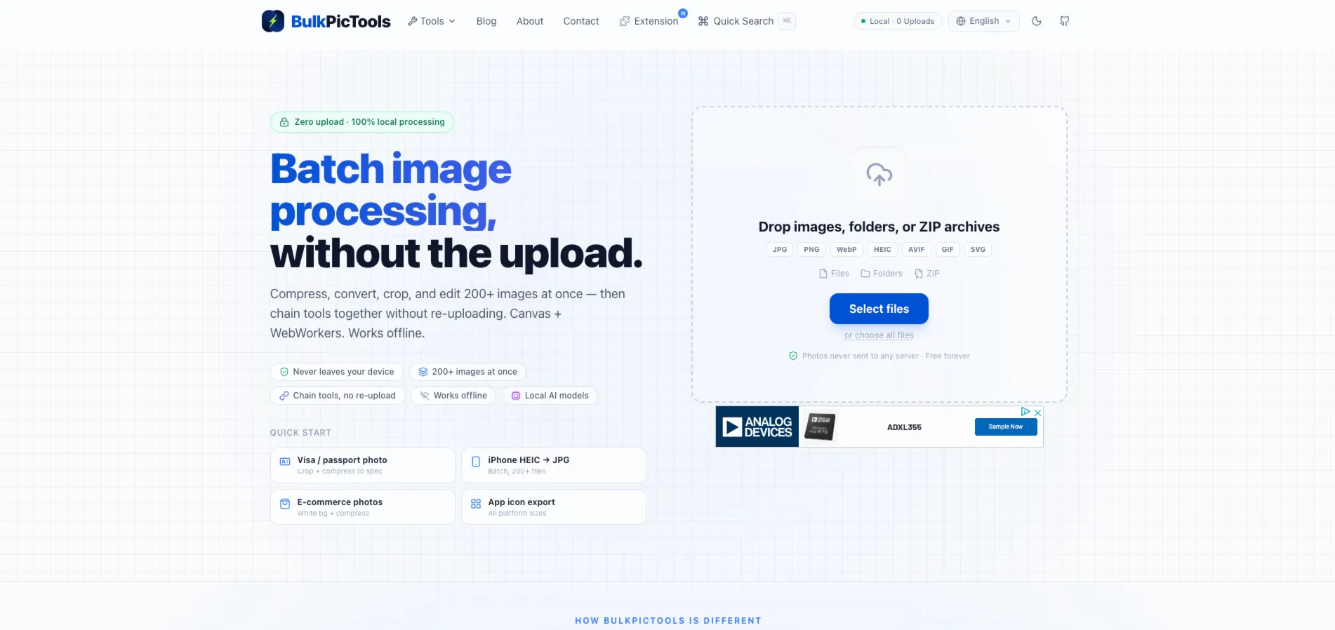
On mobile, the ad now renders at the breakpoint-appropriate size instead of falling back to a square:

Lessons Learned
data-full-width-responsive="true"is Google's own recommended setting for maximizing revenue, but the trade-off is giving up control over the final rendered size — read that as "Google decides," not "fits your layout."- Setting
data-ad-format="auto"lets Google pick between horizontal, rectangle, and other shapes based on inventory; if you need a guaranteed shape, you need to constrain it yourself. - CSS media queries on the ad's container, per Google's own documentation, are an explicitly approved way to control responsive ad sizing — no policy risk, unlike some other modifications.
- A JS-based resize listener can solve the same problem, but it's strictly more code and more state to maintain than letting CSS handle a CSS problem.
- Baking configuration into component presets versus exposing it as props is a real maintainability trade-off, not a style preference — know which one you're choosing and why.